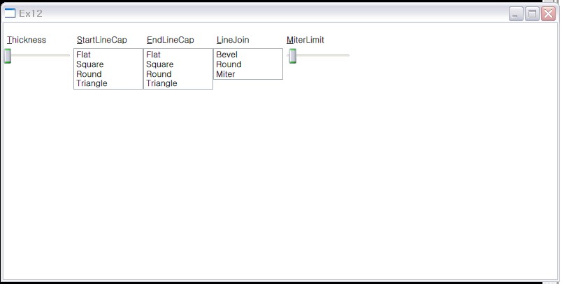
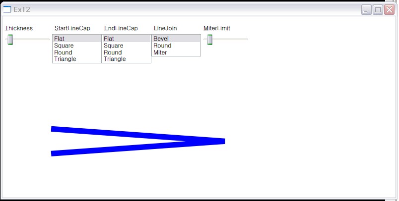
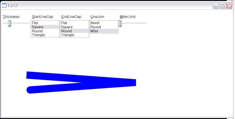
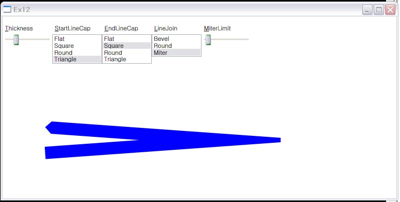
<Grid>
<!--Plyline = 다중라인-->
<!--Plyline의 속성을 바인딩시키기-->
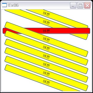
<Polyline Margin="0.5in, 1.5in,0,0" Points="50 0, 400 25, 50 50" VerticalAlignment="Center"
Stroke="Blue" StrokeThickness=
"{Binding ElementName=sliderThickness, Path=Value}"
StrokeStartLineCap=
"{Binding ElementName=listBoxStartLineCap, Path=SelectedItem.Content}"
StrokeEndLineCap=
"{Binding ElementName=listBoxEndLineCap, Path=SelectedItem.Content}"
StrokeLineJoin=
"{Binding ElementName=listBoxLineJoin, Path=SelectedItem.Content}"
StrokeMiterLimit=
"{Binding ElementName=sliderMiterLimit, Path=Value}"/>
<StackPanel Grid.Column="0" Margin="0,12,0,0" Orientation="Horizontal">
<StackPanel.Resources>
<Style x:Key="uiGroup">
<Setter Property="StackPanel.VerticalAlignment" Value="Top" />
<Setter Property="StackPanel.Width" Value="100" />
<Setter Property="StackPanel.Height" Value="12,0,12,0" />
</Style>
</StackPanel.Resources>
<!--StrockThickness 바인딩-->
<StackPanel Style="{StaticResource uiGroup}">
<Label Content="_Thickness"/>
<Slider Name="sliderThickness" Minimum="0" Maximum="100" Value="24"/>
</StackPanel>
<!--StrokeStartLineCap 바인딩-->
<!--시작점-->
<StackPanel Style="{StaticResource uiGroup}">
<Label Content="_StartLineCap"/>
<ListBox Name="listBoxStartLineCap">
<ListBoxItem Content="{x:Static PenLineCap.Flat}"/>
<!-- {}안 : 특정속성/자료값등을 얻어올때 쓰는 표현-->
<ListBoxItem Content="{x:Static PenLineCap.Square}"/>
<ListBoxItem Content="{x:Static PenLineCap.Round}"/>
<ListBoxItem Content="{x:Static PenLineCap.Triangle}"/>
</ListBox>
</StackPanel>
<!--끝점-->
<StackPanel Style="{StaticResource uiGroup}">
<Label Content="_EndLineCap"/>
<ListBox Name="listBoxEndLineCap">
<ListBoxItem Content="{x:Static PenLineCap.Flat}"/>
<ListBoxItem Content="{x:Static PenLineCap.Square}"/>
<ListBoxItem Content="{x:Static PenLineCap.Round}"/>
<ListBoxItem Content="{x:Static PenLineCap.Triangle}"/>
</ListBox>
</StackPanel>
<!--StrokeLineJoin 바인딩-->
<StackPanel Style="{StaticResource uiGroup}">
<Label Content="_LineJoin"/>
<ListBox Name="listBoxLineJoin">
<ListBoxItem Content="{x:Static PenLineJoin.Bevel}"/>
<ListBoxItem Content="{x:Static PenLineJoin.Round}"/>
<ListBoxItem Content="{x:Static PenLineJoin.Miter}"/>
</ListBox>
</StackPanel>
<!--StrockMiterLimit 바인딩-->
<StackPanel Style="{StaticResource uiGroup}">
<Label Content="_MiterLimit"/>
<Slider Name="sliderMiterLimit" Minimum="0" Maximum="100" Value="10"/>
</StackPanel>
</StackPanel>
</Grid>
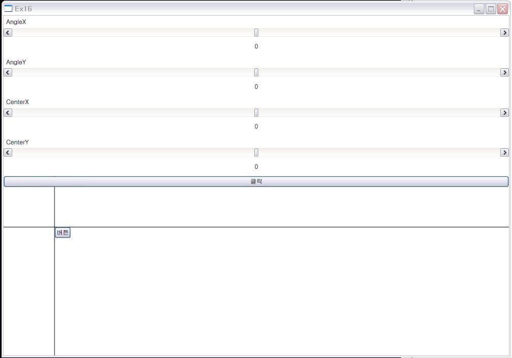
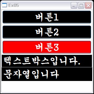
 초기상태
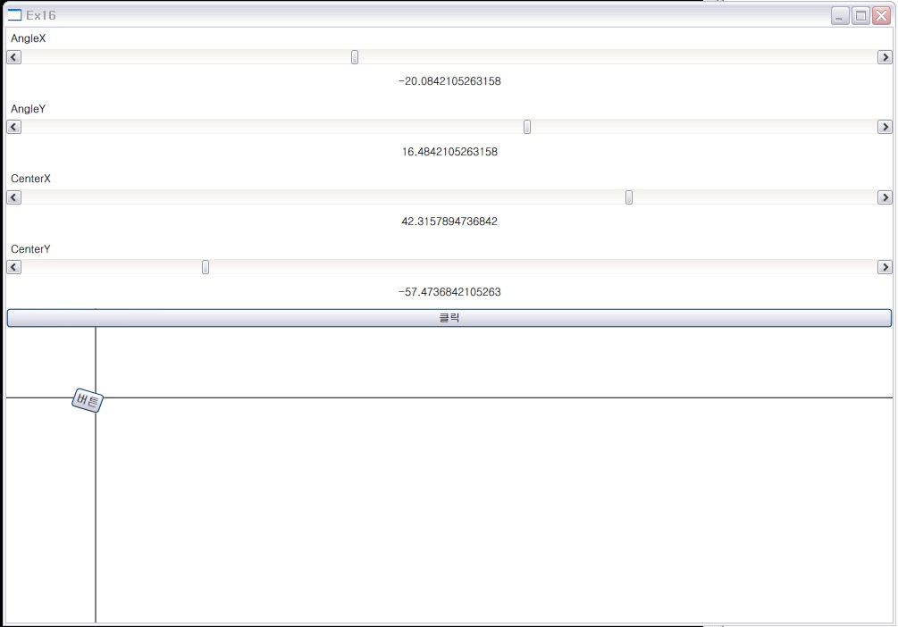
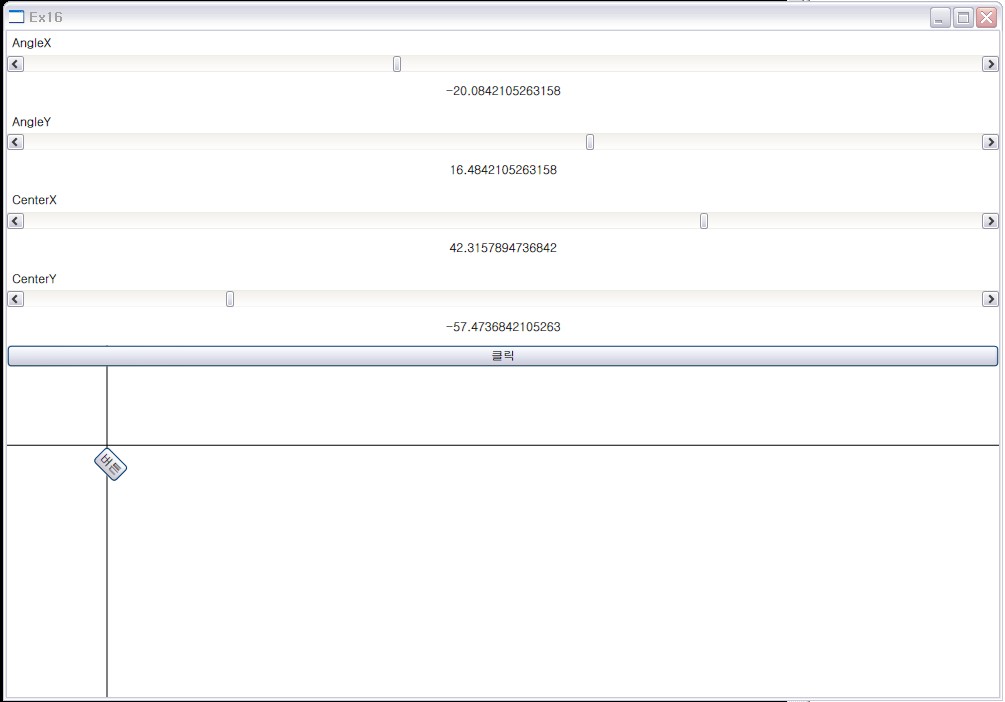
초기상태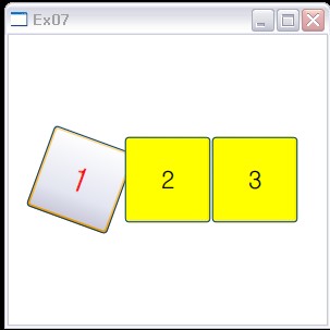 MouseOver


RECENT COMMENT